Time for a trend update today... and of course it is full of colour :) Pastel colours to be more specific. You might think that pastel colours are from the fifties, but they are back! (and will stay for a while as well). But there is more variation in different hues and combinations this time and we will show you below. But firstly a nice moodboard to get you into the pastelmood in just a second.
 |
| top: studio M, &other stories / middle: Kelly Mindell - Studio DIY, pinterest / bottom: Built by Assemble in London, found on femme actuelle |
These are the colours we are talking about; soft green (mint), pink, yellow, blue and purple. In the fifties there was a lot of mintgreen combined with pink or really soft yellow & blue tones. It definitely had a 'goody two shoes' feeling, but we will show you how you can add some of these colours in your interior without making it very girly. And we will show you how you can spice up the pastels or make it more elegant.... keep on reading :)
Vintage pastels
We will first show you the more vintage kinda pastels and how you can combine them in your home. A good way to combine pastels is of course with white, a lot of white keeps this trend fresh (without it being very girly). You can also combine these colours with all sorts of grey (warm or cool hues, depending on what pastel colour you mix it with). Adding some graphic elements in black & white, makes your pastels look more snappy. You can also mix the pastels with strong materials like marble, rough wood, concrete and metals like copper and brass. The contrast will make the pastels edgier.
 |
| top: found on stylefrizz.com, boutique1861, found on pinterest / middle: thelovelydept.com, Design Sponge, found on flickr, mintgreen bag found on urbanoutfitters.com, savilleandknight tumblr / bottom: chiccham tumblr, empatía on Behance, tendegreeshotter tumblr |
 |
| mint green chairs, great with light wood and plants / found at Modernica Case Study Furniture |
 |
| mix pastels with (graphic) black & white items / found at IDA interior lifestyle |
 |
| pastels with wood & white / found on blog freedom.com.au |
 |
| mix two pastels to make a big statement, love this bathroom! / found on easyliving.co.uk |
 |
| mix a few pastel colours with black & white graphic items / found on blog.fjeldborg.no |
 |
| pink combined with marble & copper / found on fancy! |
 |
| Graphic patterns mixed with pink and an emerald green / found on jennijuurinen.com |
 |
| don't be afraid to overdo it! this looks great / picture from VT wonen |
 |
| pastels combined with light greys, white and marble / picture from VT wonen |
 |
| all pastels colours combined / picture by VT wonen |
 |
| pastels with concrete and graphic elements / picture by 101 woonideeën |
 |
| a soft pink sofa looks great in an industrial interior / picture by Muuto |
 |
| If you like pastels, don't be afraid to show it! / found on thedesignchaser.com |
Spicy pastels
Adding some more saturated colours to pastels is a good way to make the combination more fiery and fresh. You can do that with bold pinks, greens and blues. Or try some neon colours, they mix unexpectedly good with soft pastels. Peach, salmon, copper and other orange-pink colours mix great with light blues and mint as well. Try painting a wall or your ceiling in stripes or leave them kinda unfinished... it will give some more edge to the soft colours. These colours can also be combined perfectly with dark wood. We have found loads of nice pictures to show you:
 |
| Top: found on kikki-k com, The Minimalist Home, decor8 / middle: Virginie Millefiori pinterest, Mak Mak Studio pinterest, v0tum tumblr / bottom: peppermintbliss (yellow and pink graphic), found on myfavoriteandmybest.com, found on blog upandcoming-art.com, from Chloé Douglas |
 |
| yellow, orange and turquoise go great with soft pink and the texture in the wall makes it less soft as well / picture from 101 woonideeën |
 |
| pink with (neon) yellow and copper, fresh and spicy! / picture from 101 woonideeën |
 |
| pink combined with orange and red / found in domino magazine |
 |
| pastels with saturated blue / found on femina.dk |
 |
| neon yellow with pink / found on apartment therapy |
 |
| mix pastels with orange, leather and wood to liven it up / found on curbly |
 |
| more saturated peach and pink combine great with dark wood / found on fashion4fun.com.br |
 |
| neon legs on a light blue stool, nice combination with light wood and white / found on BlindsDotCom |
 |
| you make a bold statement by painting the ceiling like this, it looks great! / found on sfgirlbybay.com |
Powder pastels
If you are not too fond of the more 'girly' pastels, you can also go for the more 'powder' like variant. These tones are less saturated and they go more towards the 'nude' and earthen colours. Lets show you the colours first before talking about how to add them to your interior.
 |
| Top: found on aamaandaav tumblr, housedoctor / middle: MUD dinnerware, plazainterior.se, found on Frenchy Fancy / bottom: found on bloesemdesign.com, iragarber.com, found on galerieshabab.com |
As you see these colours are still very soft and colourful but in a more subtle and (for some) more elegant way. You can mix and match these colours with greys, concrete, marble and other natural stones. Strong black & white photographs combine great with these tones. And of course a white background makes a great starting point for your interior. Just add as much colour as you like.
 |
| powder pastels all combined / picture by ferm living |
 |
| nudes, pastels and powder teints combined / found on Designed For Life |
 |
| powder pastels with grey and white / found on weekdaycarnival.blogspot.fr |
 |
| all powder pastels and black accents / found on 79ideas |
 |
| great powder interior, loads of colour but it is not busy / found on 79ideas |
 |
| different shades of pink and blue combined / found on 79ideas |
 |
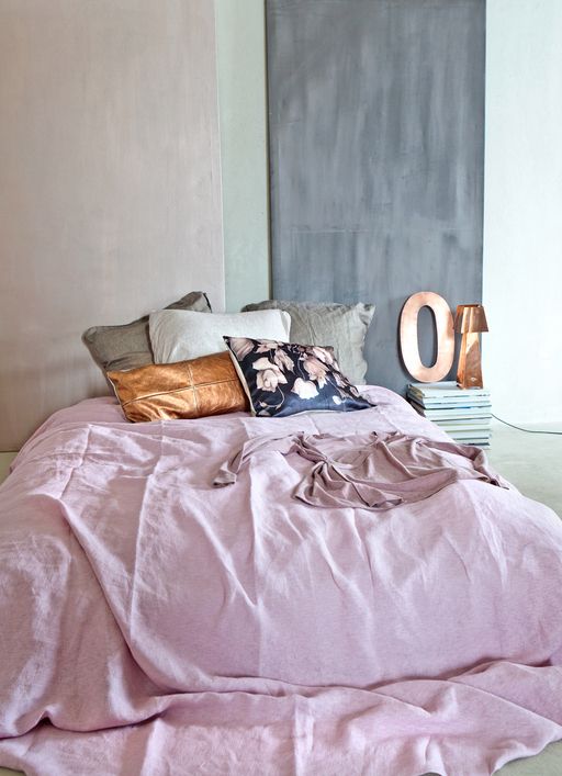
| powder pastels go great with copper and wood / found on mille m2 |
 |
| elegant, but colourful interior / teelwood Chairs by Ronan & Erwan Bouroullec for Magis |
 |
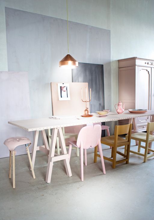
| powder colours combined with anthracite grey and wood / picture by VT wonen |
 |
| powder pastels, copper and concrete / picture by VT wonen |
We hope we gave you a lot of inspiration how to add some pastel colours to your interior by showing what kind of options you have. Of course we have gathered more pictures then we could show here, so hop on over to our pinterest board to see more!
Last picture of this post is another collage, to show that the 3 different styles we discussed can go together very well. Have fun adding pastels in your home! And we would love to see the results :)
 |
| Top: found on recycledinteriors.org, farrow and ball Pale powder, stone and setting plaster colours, found on Art and Chic / middle: empatía on Behance, muuto, Ilona van den Bergh / Bottom: MUD dinnderware, found on sightunseen, found on weekdaycarnival blogspot.com.es, HARTO La Maison d'Edition |
P.S. Would you like more pictures of pink & blue? Read our blogpost about the colours of the year 2016! (rose quartz & serenity). Do you really like bolder colours? Check our post on intense colours here (dutch only). If you would like your sofa in a great colour, take a look at this post! Of course we also made a pinterest board about pastel colours and that spring feeling!